When to use a Pie chart?
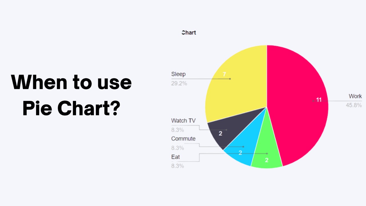
Pie charts are best used when you want to compare the proportions or percentages of different categories within a data set. For example, a pie chart could be used to show the market share of different companies in a particular industry, or the distribution of different types of expenses in a budget.
Pie charts are especially useful when you have a small number of categories, as they can quickly and easily show the relative sizes of the different categories. However, pie charts can become difficult to read and interpret accurately when there are many categories or the differences between the sizes of the slices are small. In such cases, it may be more effective to use a different type of chart, such as a bar chart or a stacked bar chart.
It is also important to use pie charts carefully and avoid using them to compare unrelated or unrelated data. For example, a pie chart should not be used to compare the market share of different companies in one industry with the market share of different companies in a completely different industry. This can lead to misleading conclusions and should be avoided.