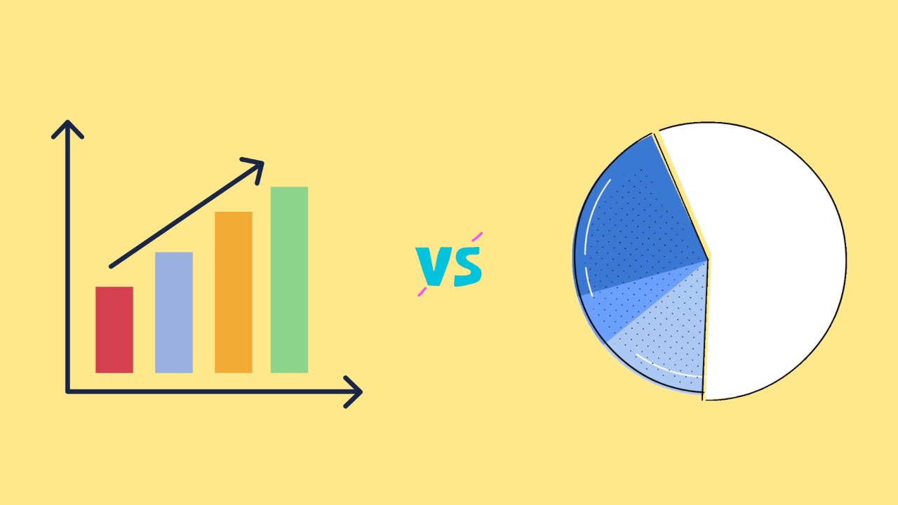
When to use a Pie chart vs a Bar graph?

Pie charts and bar graphs are two different types of visualizations that are used to represent data. While both can be useful for showing the proportions or percentages of different categories within a data set, there are some key differences between the two that make them more suitable for different types of data and scenarios.
One major difference between pie charts and bar graphs is that pie charts use slices of a circle to represent the different categories, while bar graphs use bars of different lengths. This means that pie charts are best used when you have a small number of categories, as it can become difficult to accurately compare the sizes of the slices when there are many of them. In contrast, bar graphs are better suited for larger data sets with many categories, as it is easier to compare the lengths of the bars.
Another key difference between pie charts and bar graphs is the way they are read and interpreted. To read a pie chart, you need to compare the sizes of the slices and the angles at which they are drawn. In contrast, bar graphs are read by comparing the lengths of the bars, which can be easier and more intuitive for some people.
In general, pie charts are best used when you want to quickly show the relative sizes of a small number of categories, and when you want to emphasize the proportions or percentages within the data set. Bar graphs are better suited for larger data sets with many categories, and for showing the exact values within the data set.