Where Pie charts are used?
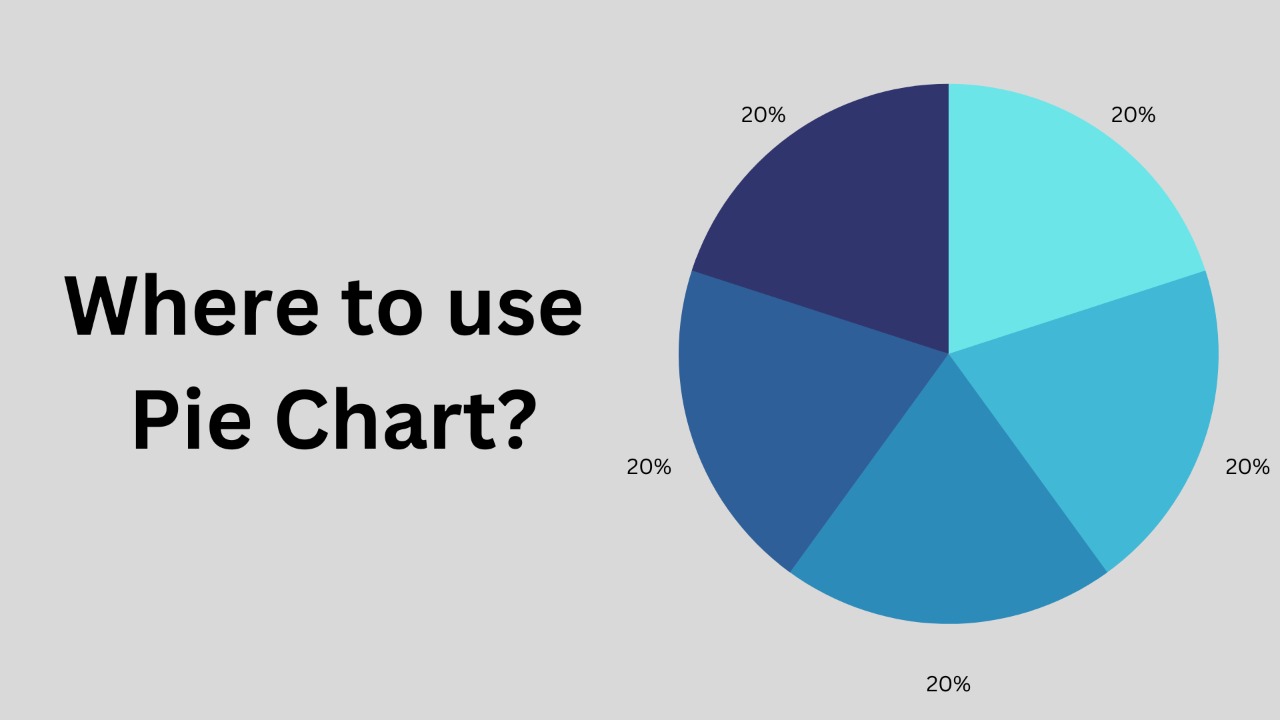
A pie chart is a graphical representation of data that uses slices of a circle to show the relative sizes of the data. Each slice represents a category of the data, and the size of the slice represents the size of that category relative to the other categories. Pie charts are typically used to show proportions or percentages, and can be useful for showing how different parts make up a whole.
Pie charts are best used when you want to compare the proportions or percentages of different categories within a data set. For example, a pie chart could be used to show the market share of different companies in a particular industry, or the distribution of different types of expenses in a budget.
Pie charts are especially useful when you have a small number of categories, as they can quickly and easily show the relative sizes of the different categories. However, pie charts can become difficult to read and interpret accurately when there are many categories or the differences between the sizes of the slices are small. In such cases, it may be more effective to use a different type of chart, such as a bar chart or a stacked bar chart.